Noughty
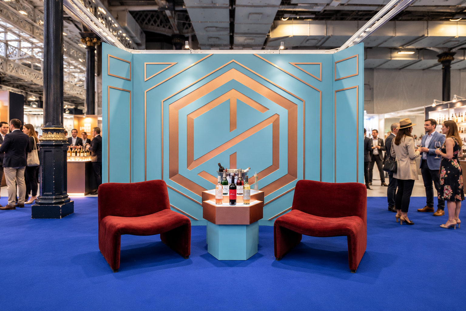
Commissioned to design an exhibition stand for Thomson & Scott's alcohol-free wine brand Noughty at the London Wine Fair, I worked closely with the founders Amanda Thomson and Ian Scott to develop a spatial identity for their presence at the event.
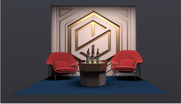
Starting with the brand's contrasting photographic styles, I explored different creative directions before developing a more classic, architectural approach - combining the familiar language of premium wine with a fresh, contemporary character.
Early concept directions
Translating the brand into space
The starting point was the company's geometric monogram, which I transformed into an oversized architectural feature. Layered bronze detailing created a sense of depth, while turquoise panelling and burgundy seating brought a more playful and modern quality to the otherwise classic design.
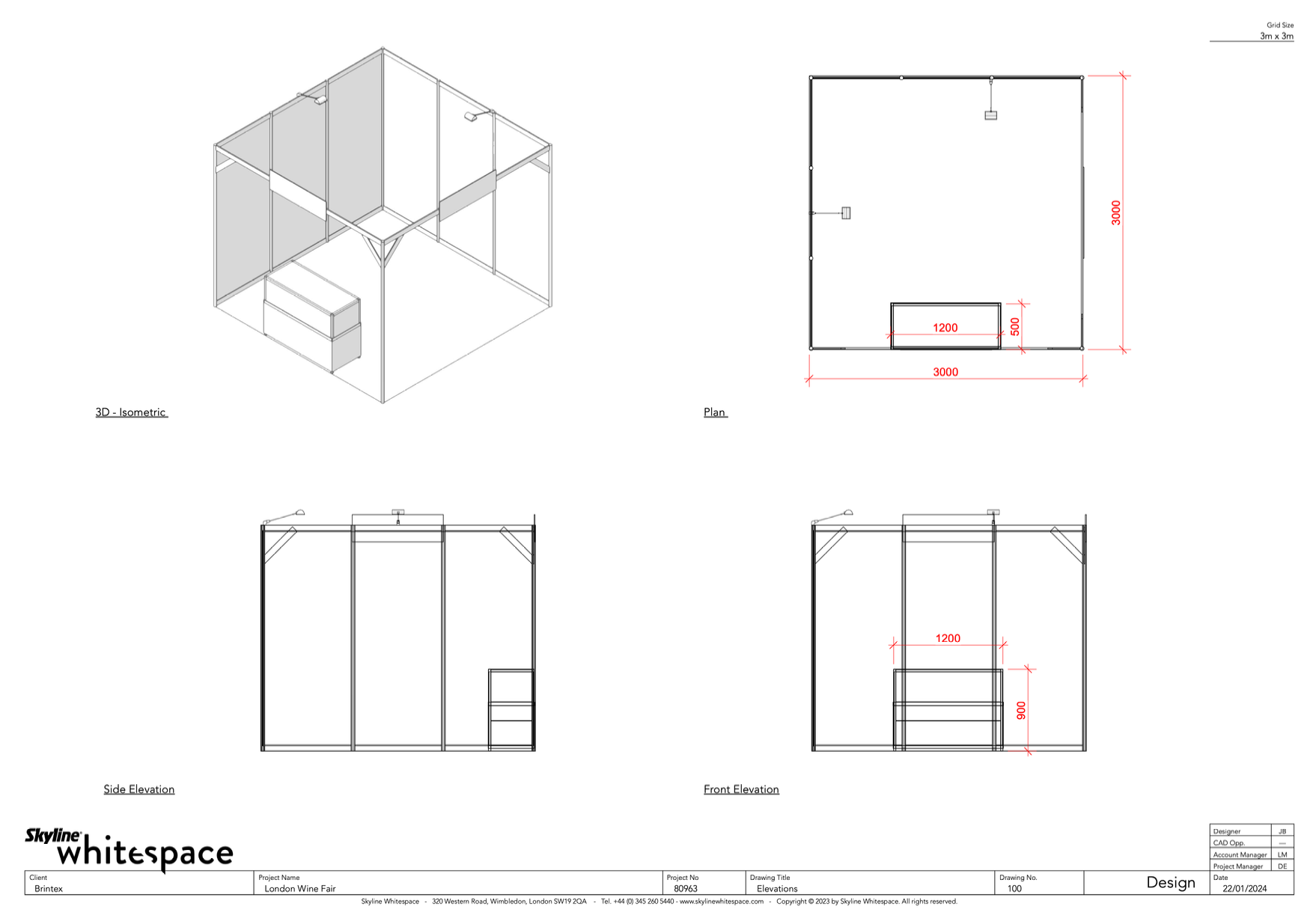
Within the limited footprint, the aim was to create an intimate tasting environment that felt distinct from the surrounding trade stands. The angular corner detailing responded both to the compact freestanding layout and to the geometry of the monogram, helping soften the otherwise rigid shell-scheme structure.
FROM CONCEPT TO CONSTRUCTION
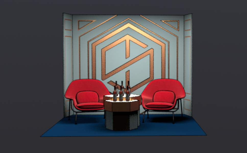
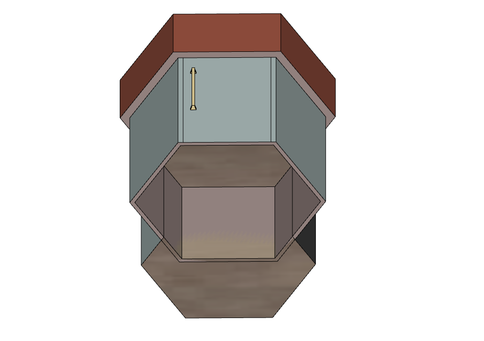
Working within the constraints of a standard exhibition shell scheme, I developed the spatial layout, furniture selection and custom display table, using SketchUp and V-Ray to test materials, lighting and presentation.
The table incorporated illuminated display surfaces and concealed storage, with lighting studies exploring how the bottles and glass would respond to the integrated light source.
I coordinated the design with the exhibition organisers and stand builders, overseeing its translation from concept to installation.
the Finished experience
The final stand translated the agreed visual direction into a compact but distinctive exhibition presence. The classic palette and architectural language established here went on to inform the brand’s subsequent exhibition styling.
Digitally reconstructed exhibition view based on original design visuals and photographic documentation.
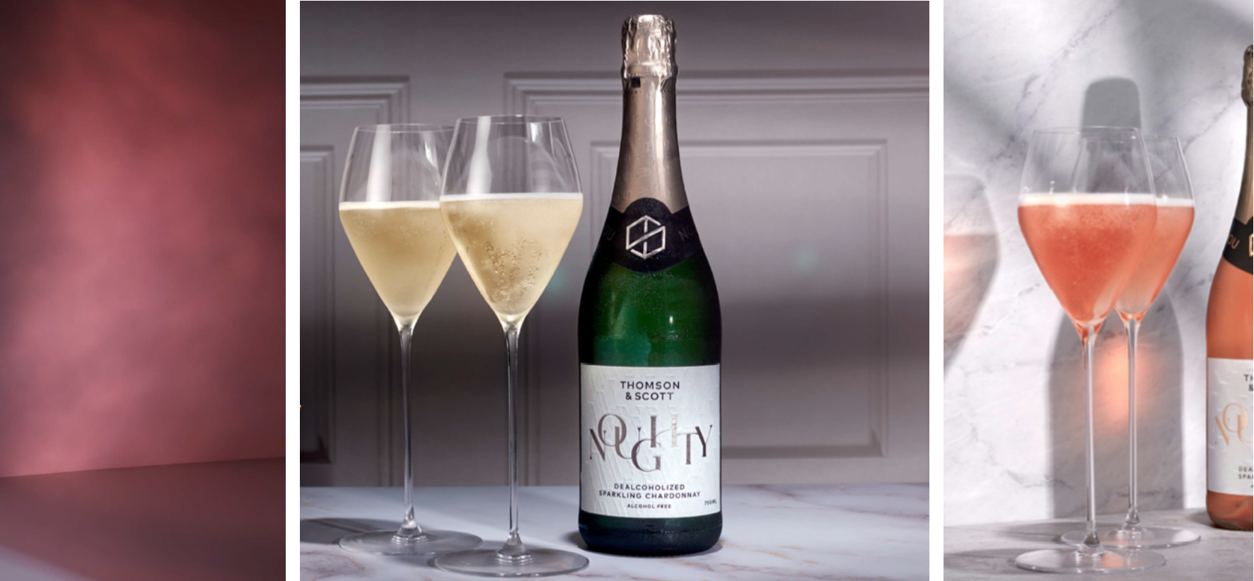
Chosen concept: a more classic and architectural interpretation, giving the stand a stronger premium presence.
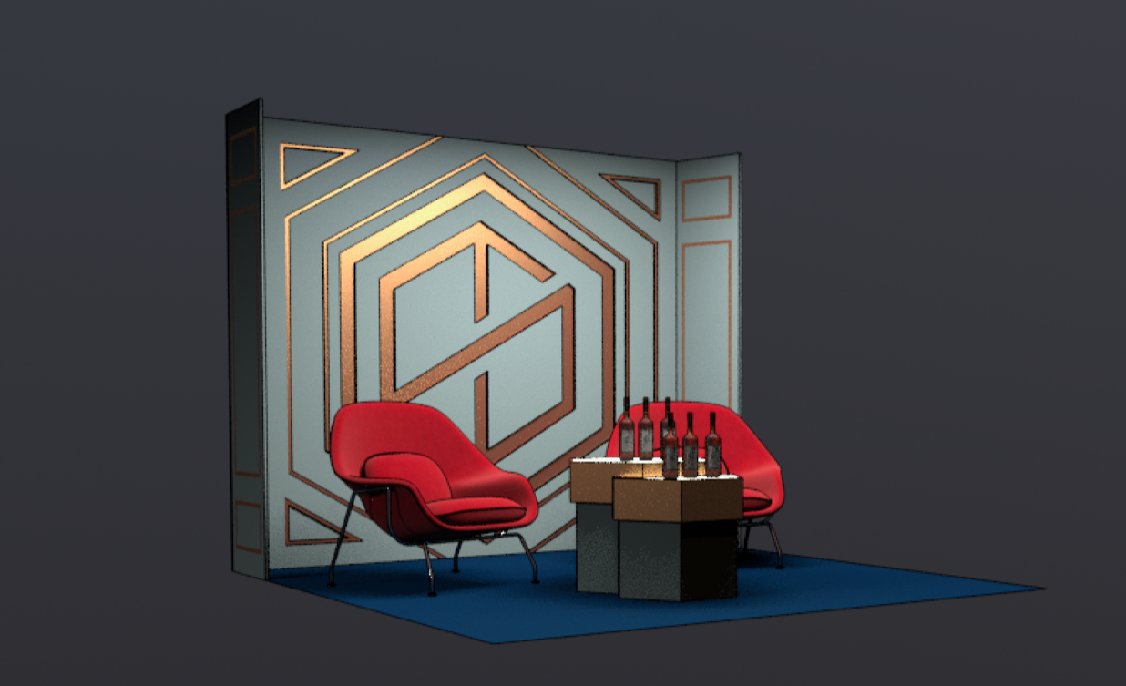
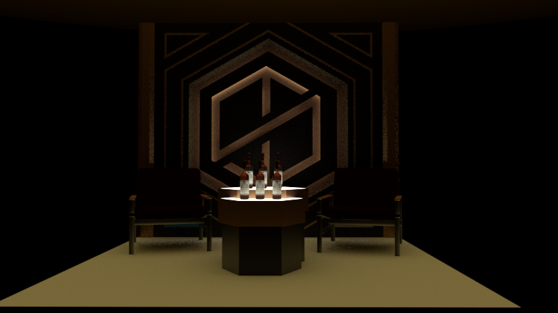
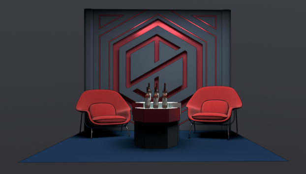
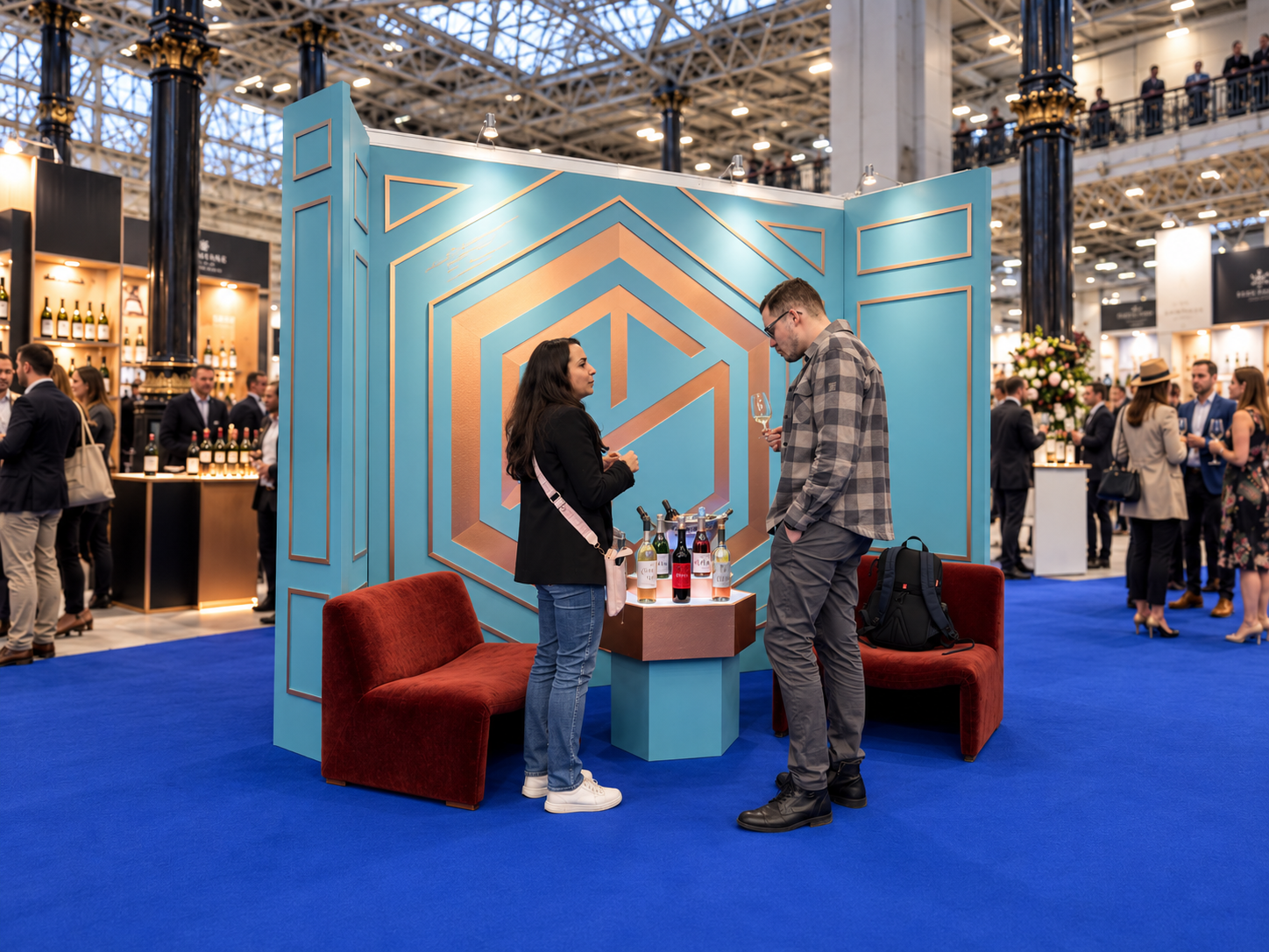
Digitally reconstructed exhibition view based on original design visuals and photographic documentation.
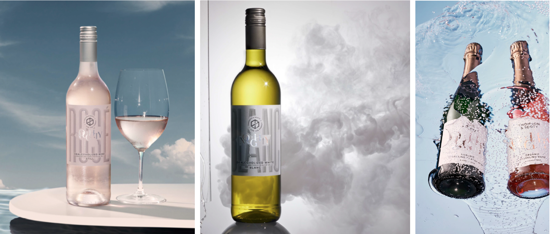
Early concept: a lighter, more playful interpretation based on the brand’s brighter photographic styling.